Two Rex Plays #4 - Welcome To…
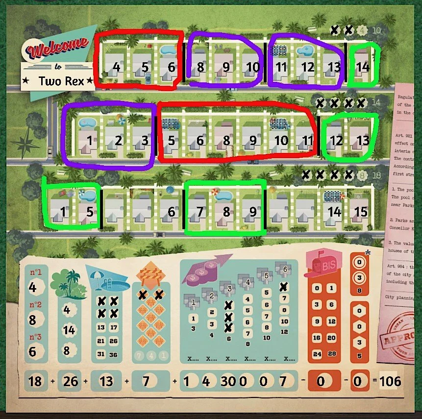
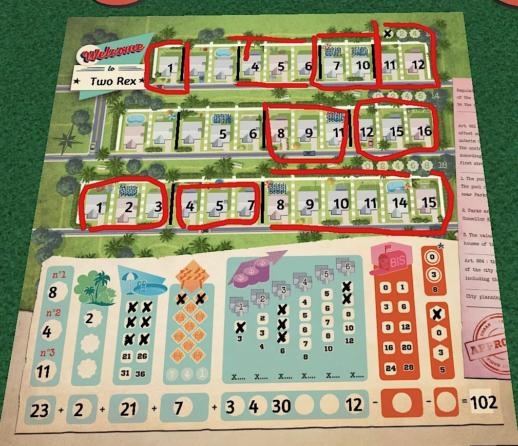
In this edition we’re discussing the original version of Welcome To… designed by Benoit Turpin and published by Blue Cocker Games. In this flip & write you’re transported back to 1950’s America to build the houses which will accommodate the baby boom from the golden age of capitalism. Whilst on the surface you’re constructing swimming pools and fences, this is an attractive window dressing (or more thematically, a façade) for an elegant number sequencing puzzle which is the heart of the game.
Here are the mechanisms and design choices that we enjoyed:
Quick but strategic – We found the pace of the game to be refreshingly quick, with most turns only taking a minute or two before both players are happy to flip the cards and move on. Whilst the pace is breezy, the game still feels strategically satisfying with multiple viable paths to victory and a ‘decision space’ which feels challenging and appropriate to the speed and weight of the game.
Clear graphic design - The icons are thematically strong and make use of different colours for each section, which makes it easier to navigate between the cards and the player sheet. Whilst not colour blind ourselves, this is a useful feature for those who are, as the icons can stand in place of the colours.
Efficient use of cards – Each card is initially used to show a number which you need to assign to a house which you’re building. The card is then flipped to show the alternate face which indicates the special effects which will apply in the next round. The corner of the card also shows what special effect is on the flip side, allowing you to plan for what’s coming-up next. Using the cards for multiple functions is an intelligent design feature which reduces the form factor of the game, both on the table and in the box.
Integrated illustrations – Elements of the player sheets use illustrations as ways to mark off progress, reducing the reliance on purely functional tick boxes and circles. Writing a house number on a tiny house plan may sound minor, but it feels more fun and helps draw you into the theme.
Diverse strategies, close results – Whilst both players are using the same pool of cards on each turn, their playing sheets are likely to quickly diverge as you’re able to follow different strategies. At the same time, we never felt like the balance was out and one player was pulling too far away from the other.
We last played this after a busy day looking after the little Rex’s and juggling our respective non-game design jobs. Even in a hobby which you really enjoy, sometimes the thought of setting up and starting a heavier game can feel overwhelming. Purposefully lighter experiences like Welcome To… can feel like a nice palette cleanser (or perhaps nightcap?) for those evenings where you just want to play something quick and satisfying.
Interested in Welcome To…? Find out more here:
Blue Cocker Games
http://bluecocker.com/en/landing-page/
TTS workshop (scripted)
https://steamcommunity.com/sharedfiles/filedetails/?id=2030704196


